Visual Literacy

Rule of thirds

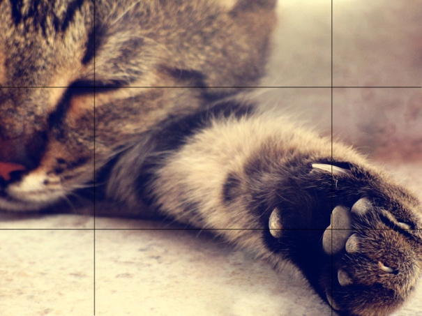
Imagining the image splitting into 9 parts, by breaking it down into thirds (both horizontally and vertically) which identifies four important parts of the image.

Placing these points of interest in the intersections or along the lines of the photo results in a well balanced photographs a viewer can interact with naturally.

Ink Sea by Ahermin

Take My Paw by Misurani


Posted in Stop Frame Animation

GRAPHIC DESIGN

The impact of technology and technical developments

The advent of the Internet and e-commerce has brought a large new income stream to the design industry. Internet technology also leads to easier working between designers and their clients worldwide, a particular strength when dealing with global clients.

Graphic art software applications like Adobe’s PhotoShop and Illustrator enable designers work at much faster rate and more independently. Computers and software applications  are generally seen by creative professionals as more effective production tools than traditional methods. They do not limit the creativeness of a designer with spacial needs, materials or time.

An important factor to note, is that as well as making the design process easier, the technology improvements give more and more job opportunities for the designers in the industry. The digital approach to any kind of market demands for a competitive edge via the design of websites and advertisements.

Legal and statutory controls

Intellectual property law is made up of many elements of legal protection and a business might be concerned with any number of them. In some cases, IP ownership and its associated protection is inherent in the creation of the work and does not necessarily require further registration. Copyright is one example, which typically applies to ‘artistic’ works, such as books, music, software code and graphics. In other types, such as patents, registration is required. The tricky aspect is that any given design may qualify for one or more of the different intellectual property rights. Graphic design for a book, for example, would qualify for copyright, whilst the graphic elements of product packaging – such as the colours, lines or contours – might qualify for a ‘registered design right’, which is a different thing.

The main types of intellectual property rights are:

– Patents

– Copyright

– Unregistered design right

– Registered design right

– Trademarks

Contracts are a crucial thing and the designer should always value their ideas.

Health and safety issues

Business and financial support organisations

ARTS COUNCIL       http://www.artscouncil.org.uk/
The Arts Council’s mission is to develop, sustain and promote the arts. The Council’s priority is to bring the arts to a wider audience, encourage individuality and experimentation, nurture creativity across the generations, embrace diversity of culture and explore new forms of expression.The Arts Council is an independent, non-political body working at arm’s length from the Government.

CIDA    http://www.cida.co.uk/

CIDA is a specialist support agency that provides services to the creative and cultural industries.

Services include business consultancy, organisational development, strategic planning, marketing support, funding guidance, training advice, publication and distribution of relevant information, signposting relevant services, facilitating networking, and supply chain and cluster development.

It also offers advice, training, fundraising, networking, an online directory, factsheets and funding databases, as well as consultancy covering research, marketing, project and event management expertise.

MY CAKE      http://www.mycake.org/

MyCake provides online book-keeping and benchmarking services specially tailored for the needs of Creative Entrepreneurs. They also run monthly training sessions to help Creative Entrepreneurs to get a grip on their financial management without boring themselves to tears.

Industry and professional associations

AIGA: the professional association for design, is committed to advancing design as a professional craft, strategic tool and vital cultural force.

DBA: Trade association for design consultancies promoting effective design & encouraging high standards. Doesn’t provide careers advice but website provides details of its 200 member consultancies & showcases award winning design work.

Posted in Stop Frame Animation

Dana E. Glauberman (task 7)

Dana E. Glauberman

Dana E. Glauberman is an American film editor from California who has been editing a few of Jason Reitman film.  She studied at the University of California and worked for several years on the editing crews on a couple of television shows. In the 90s, she became acquainted with Jason Reitman and began to informally assist him in editing his early film projects which has helped her editing work to be noticed. Glauberman worked as the main editor of feature films such as ‘No Strings Attached’ (2011), ‘Love Happens’ (2009), ‘Up In The Air’ (2001), ‘Juno’ (2007), ‘Factory Girl’ (2006), ‘Thank You For Smoking’ (2005) and other comedies and romance films. She also worked in the editorial department of big films like ‘Mean Girls’ (2004), ‘Pirates of the Carribean: The Curse of the Black Pear’l (2003), E.T.: The Extra-Terrestrial (2002 – special edition), ‘Evolution’ (2001), and ‘Road Trip’ (2000).

Dana Glauberman has won The 2009 Editor of The Year Hollywood Film Award, has been three times nominated for an Eddie Award  of 2009, 2007 and 2005 by the American Cinema Editors for her work on ‘Up In the Air’, ‘Juno’ and ‘Thank You For Smoking’ as the best edited feature films. She was also nominated for a BAFTA Film Award of 2010 for Best Editing on ‘Up in the Air’ and received another nomination for a Critics Choice Award that year from Broadcast Film Critics association fro the same film.


Links:

Dana E. Glauberman at the Internet Movie Database

Making the Right Connections: Dana Glauberman Flies Solo as an Editor‘ by Laura Almo; Editors Guild Magazine (November- December 2009, Issue 30, 6)

Meet Dana E. Glauberman, Jason Reitman’s Editor Extraordinaire‘  by S.T. Vanairsdale; Behind the Camera on Movieline (11-04-2009)

Contender – Editing – Dana E. Glauberman – Up in the Air‘ by Mary Anne Sweres; Below the Line (18-11-2009)

Posted in UNIT 3

Common cuts use in editing (Task 4)

Cutting on action – the most used cut, simply creates a logical sequence of action where one image simultaneously replaces the other.

‘Battleship Potemkin’ (1925) Sergei Eisenstein

Battleship Potemkin is full of simple and obvious cuts to use as an example. In this scene, the shot with the soldier’s legs and guns shooting out is interrupted by a shot of the woman screaming in pain. This creates continuity and we understand the the woman has been shot by the soldiers without having to see the bullet fly through the air and enter the woman’s body.

Match cut – this cut complements or ‘matches’ the other following it so smoothly that there seems to be no break in continuity.

‘Indiana Jones and the last crusade’ (1989) Steven Spielberg

Spielberg uses a match cut to bring Indiana from youth to adulthood. In the first shot Indiana the boy bows his head to receive the famous hat; as the head lifts in the secod shot, it is the grown up Indiana who is wearing it.

Jump cut – a break in continuity that leaves a gap in the action creating emotional impact.

‘Breathless’ (1960) Jean-Luc Godard

The main character shoots a police officer in Marseilles, runs across a field and emerges in Paris without the viewer seeing the character in transit.

Cutaway – this shot briefly interrupts a scene to reveal information needed to accelerate the plot by inserting a shot which is different in subject matter from the previous one.

‘The Dead’ (1987) John Huston

In the scene from The Dead, the beginning of a dinner is interrupted by a cutaway to the street outside, then the dinner table again where the guests have finished eating.

Cross cut – a way to show two actions occuring simultaneously.

‘The Godfather’ (1972) Francis Ford Coppola

Sound/ music cut (L cut) – images and their corresponding sound are edited slightly out of sync: the audio is either shortened or extended in relation to the video clip. This prepares the audience for a coming change.

‘Silence of the Lambs’ (1991) Jonathan Demme

In the scene where Clarice is leaving her first interview with Dr. Lecter. She has just been humiliated and remembers her father arriving home from work one day when she was a child; after he picks her up and spins her around, the camera pans over to a passing truck and tilts up to the sky. Then we hear Clarice’s sobs and cut back to her outside the mental institution, leaning on her car and crying.

Dissolve – denotes continuity by the gradual replacement of one shot by another.

‘The Shining’ (1980) Stanley Kubrik

The scene where Wendy is talking to her son Danny dissolves into her husband at the interview.

Posted in UNIT 3

Shots and Movements

THE ESTABLISHING SHOT – lets us know where the action is taking place and is usually a wide shot of a forest, building or any other area like that.

Here is an example of an establishing shot in the opening credits of ‘Funny Games’ (1997) by Michael Haneke; the camera is following car is driving down the road, through the treetops…

MASTER SHOT –  a long shot that captures all the main characters. Being a very important shot in any scene, the master shot is being used less by editors and filmmakers since it  is considered to be too ‘stagey’.

SHOT/REVERSE SHOT (TASK 5) – a sequence of 3 shots capturing a conversation, a standoff or an encounter between two or more people.

This exeprt from George A. Romero’s ‘Dawn of the Dead’ (1978) shows a clear shot-reverse sequence at 1.02 where Francine is having a conversation with Stephen.

Another example of a shot-reverse shot is the following final scene of Cameron Crowe’s ‘Elizabethtown’ (2005). Claire had instructed Drew to go  to the ‘Second Largest Farmer’s Market in The World’ in her elaborate map with instructions and a compiled music cd; and to ‘look for the girl with a red hat’. After looking desperately for a few minutes, going throgh folk wearing red hats, Drew finds Claire and the camera shifts from Claire to Drew with a bit of her head and a shoulder out of focus and back to Claire.

In Adrian Lyne’s version of ‘Lolita’ (1997) the scene where the girl carries Humbert’s breakfast up the stairs, then tells him ‘don’t tell mother that I ate all your bacon’, the camera looks at Humbert over Lolita’s shoulder, then back at her and back at Humbert again to show his reaction.

POV SHOT (TASK 6) – looking directly through the character’s eyes.

This technique is often used to place the audience in the position of the main character. The POV shot usually begins with a character looking off-screen, followed by a cut to the object they are looking at.This shot allows the viewer identify with the character and understand more closely what they feel.

In M. Night Shyamalan’s film ‘The Happening’ (2008), we get a scene towards the end of the movie where there is a POV  shot of the grass/trees or nature, who is the antagonist, looking at the main characters.

In the following scene from Stephen Shainberg’s ‘Fur: An Imaginary Portrait of Diane Arbus’ Diane, the protagonist, buzzes the intercom to talk to the mysterious neighbour about dog hair blocking the pipes..  As she does, the camera view changes and we see Diane from within the intercom, the view obscured by speaker mesh (around 3.30 minutes into the video) having a  conversation with the neighbour. Although it is unrealistic that the second character is inside the intercom, it still represents that he is on the other side watching her, making this a POV shot.

Lastly, one movie known for its amazing POV shots is Spielberg’s masterpice ‘The Jaws’ (1975). A random  exert from the film is full of the sharks’s point of view:

Posted in UNIT 3

Continuity editing

Continuity editing is the  arrangement of shots in a way that allows the actions flow together giving the illusion of narrative continuity.

The goal of continuity editing is to make the work of the editor as invisible as possible. The viewer should not notice the cuts, and shots should flow together naturally. Hence, the sequence of shots should appear to be continuous.

The film makers must consider these qualities in order to achieve that:

– the overall toning of shots

– the balance and symmetry of the frame

– the similarity of lighting

– the action taking place in the centre of the frame

The 180° rule: shots must be taken only from one side of the action so that two characters (or other elements) in the same scene should always have the same left/right relationship to each other.

‘Crossing the line’ is the term used when the above rule is broken, when the camera passes over the imaginary axis connecting the two subjects. The new shot that is taken from that opposite side is called a reverse angle.

The following scene from Peter Jackson’s ‘The Lord of The Rings’, where Gollum is having a continuous conversation with his evil self, is a great example of how strong the continuity can be in terms of helping the viewer understand what is going in on… Notice how  The good Gollum is always filmed from the right side, the bad – from the left; the camera keeps panning from one side to the other intenting to create a sense of a real dialogue despite there being only one character!

Akira Kurosawa used over 400 separate shots seamlessly edited together in him multi-layered film ‘Rashomon’ (1950) to make it appear as if there were fewer edits!

The film includes inventive tracking shots (eg. the chase of the bandit after the couple and also the woodcutter), a radical flashback structure, unique framing and lighting (Kurosawa shot directly at the sun through the dense forest branches and leaves), and characters speaking to the audience, or to the ‘fouth wall’ as far as they are aware…

‘The Man with a Movie Camera’ (1929), is a beautiful experimental avant-garde film by Dziga Vertov who employed some of the first uses of the split screen, montage editing, extreme close-ups, and rapidly-filmed scenes in its view of Moscow and other cities..

This creative film demonstrates all modern movie conventions by showing the roles of cameraman and the editor in the creation of a film during a single day.


Posted in UNIT 3

Linear editing vs. Non-linear editing (task01)

Used to be known as just ‘video editing’, linear editing is a more traditional approach to video editing. It is a process of selecting, arranging and modifying the images or sound recorded which involves cutting the film tape permanently. Apart from the fact the tape can be ruined it is also a very tedious process of playing and shuffling through adjacent footage.

Vision Mixer for linear editing

Non-linear editing is the modern improved, digital system for editing. It allows the editor to randomly access any frame on the source material ensuring flexible editing. Working with the non-linear system means there is a controlled generation loss, original files aren’t lost of modified during editing and it is possible to work on low resolution copies due to edit-decision lists, saving computer processing power.

There are many free non-linear video editing software available today such as Apple Inc.’s iMovie, Microsoft’s’ Windows Movie Maker and AVS Video Editor.

iMovie (Apple Inc.)

AVS Video Editor

Windows Movie Maker (Microsoft)


THREE-POINT EDITING

When adding media to the timeline, you select 4 points: the in and out point of the clip and the in and out ponts on the timeline. What the 3-point editing system does, is it selects the last point automatically so all you have to do is define 3 out of 4. This is a very useful technique if you need to fill in a gap in the timeline or when trying to match up an audio track to video.


Posted in UNIT 3

The Swallow’s Tail by Salvador Dalí, 1983

Oil on canvas. 73 cm × 92.2 cm (28.74 in × 36.30 in). Location: Dalí Theatre and Museum, Figueres

This was the last work of the great Surrealist Salvador Dali. The Swallow’s Tail is a final part of Dali’s ‘Series on Catastrophes based on mathematician Rene Thom’s Catastrophe Theory.

This masterpiece contains in itself beatifully arranged shapes of Thom’s Swallow’s Tail graph, the Second Catastrophe graph and The Cusp all of which are elements of the four-dimensional phenomena. Dali also added curves of a cello which are found at the top left of the painting and its f-holes in striking red and black that are associated with the mathematical symbol for an integral. All of these elements are painted over a painted stretched bluish white sheet with that of a stone crack in it’s center and creases represented by a darker blue which give it a surrealistic look since it is unusual for a stretched fabric to have creases…

The painting has a dark background with lighter holes where the stretched sheet corners and edges are hidden.

Salvador Dali, being one of my favourite artists, The Swallow’s Tail as my all-time favourite surrealistic painting has always impressed me with its rich simplicity of beautiful tones of blue, contrasts of black and red, striking severe lines against the softly toned sheet. Knowing nothing about dynamical systems in geometry, the arrangement of content and Dali’s wit of art still manages to paralyse my eyes and leave me staring at the Swallow’s tail for continuous moments.

http://en.wikipedia.org/wiki/Catastrophe_theory#Swallowtail_catastrophe
Descharnes, R. and Neret, G. (2006) Dali, Taschen.

Posted in Art & Technology

Kazimir Malevich (1879 – 1935)

Why his work is considered to be a development of Modernism:

Malevich founded an art movement that started in the begining of 20th century in Russia focused on basic geometric forms, especially the square and circle, known as Suprematism. It has developed from the modernist idea of abstraction and cubism but taken to a complete extreme, resulting in a clean geometric shape of a single, bold colour. Malevich’s famous example of such is the Black Square, 1913.

Black Square, 1913 by Kasimir Malevich

Why his work is post-modernist?

Malevich’s work is a development of Cubism which was a part of modernism, suprematism was a new art very different from previous though based on the same idea as modernism.

Malevich’s work…

Although he was initially influenced by cubism and primitive art, which were both based on nature, Malevich’s theme being the internal movements of the personality, had no precise form, and he found it from within the visible expression of what he felt.  Pure minimal paintings include simple geometrical shapes with various but never mixed or graded colours. The severe edges and angles take them away from the reality, the shapes float freely on the canvas either overlapping, connected or on their own.

Two-Dimensional Self-Portrait, 1915 by Kasimir Malevich

Suprematism, 1916-17 by Kasimir Malevich

His intentions for and meanings of his work…

The simplicity of Malevich’s forms signify a new begining, he believed in an extreme of reduction: `The object in itself is meaningless… the ideas of the conscious mind are worthless’, he wanted a non-objective representation, `the supremacy of pure feeling.’ [Malevich].

How his work reflects the period in which it was made:

In 1920s, at the time of Stalin, the state began limiting the freedom of artists prohibiting abstraction and divergence of artistic expression but Malevich got away with ‘hidden’ supremacy in his Self-Portrait  by abiding the Stalinist rules and painting the geometrical white collar against the bold black jacket thus keeping his style.

Self-Portrait, 1933 by Kasimir Malevich

Links:

http://www.russianpaintings.net/doc.vphp?id=126

http://www.ibiblio.org/wm/paint/auth/malevich/sup/

Posted in Post 1945 Modernism & Post- Modernism

Joseph Beuys (1921-1986)

Description of his work and its content:

Beuys’s work is presented in a variety of media like sculptures, paintings, videos and even perfomances. It culminates the ‘extended definition of art’ [http://feltworks.wordpress.com/2010/04/22/joseph-beuys-felt-metaphors/] – the type of artwork that some people do not consider to be art. He uses random material such as fat and puts it anywhere like a gallery next to a coyote.


I Like America and America Likes Me, 1974 by Joseph Boyce


Granite in Arid Chalk, 1965 by Joseph Beuys

Beuys’s intentions for and meanings of his work…

He was emotionally affected by an experience he had in life caused by WWII, where his life was saved thanks to felt and fat. Because of this, he was in a way obsessed with felt and fat material and used it to produce works associated with WWII’s  icons. He uses the two materials to insulate objects, to protect just like it protected and saved Beuys. The below work ‘Infiltration Homogen für Konzertflügel (Homogenous Infiltration for Grand Piano), 1966 illustrates that. The red cross is stitched onto greased and felted piano that can still be played all of this portrays a healing effect


Homogeneous Infiltration for Piano, 1966 by Joseph Beuys


 How does his work reflect the Contemporary Art period?

His work can be put in the ‘Anything and Anywhere Art’. The combination of such uncombinable ingredients in his creations give a disgusted reponse from the observer imagining his clothes being covered in sticky grease due to felt being fabric and associated with clothing. Or sitting on a grease insulated chair, or playing the piano.

  My response:

I cannot accept Beuys’s work as art. I don’t find it visually, emotionally or intellectually pleasing.
The whole concept of ‘healing’ could have been well represented in one work, thus making the message more valuable and more shocking. Because of Beuys’s technique of using fat, felt and time to portray his meaning, I feel the repetition of that in his following works have ruined an interesting concept…

Posted in Contemporary Art & Design